|
Purely as a speech based form of news it is understood by mariners that the internet isn’t a part of the maritime safety information system and therefore should not be relied upon as a means of obtaining the latest forecasts. In a 21st century world in an increasingly online culture it’s easy to see why the future of the Shipping Forecasts is being questioned. With the information that is read being presented in writing on the BBC and Met Office websites it sparks questions as to why it is treated with an entirely different rulebook to the everyday forecasts. A normal forecast is also of spoken word yet accompanied by everyday iconography to make it comprehendible for everyone.
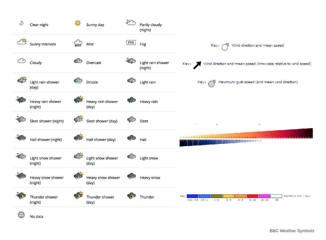
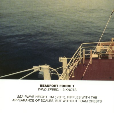
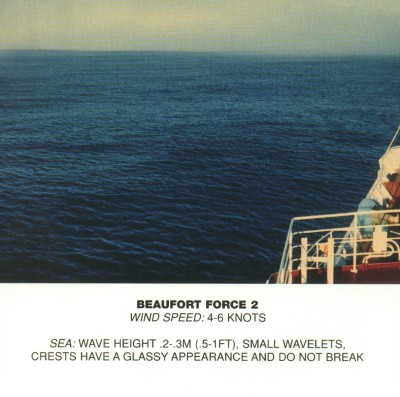
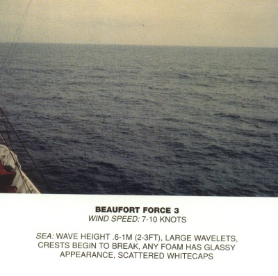
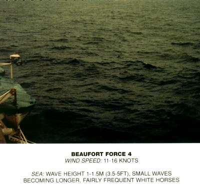
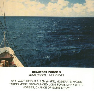
The forecasts have always been intended as an audio medium, a short term, six hour forecast in a specific format and language that renders any visual props largely unnecessary beyond a basic knowledge of the geography of the sea areas. This helps those at sea because of its concise nature when there is other things to focus on however with a larger part of its listeners being the land lubber, it’s interesting to see that this audience has never been addressed by the BBC and never has it been catered for. The Beaufort scale is a measure that relates wind speed to observed conditions on land or at sea. It is used in the Shipping Forecasts to create a visual comparison for mariners. The Beaufort Scale is a great and relevant example of information displayed and visualized in different ways. It's got a symbolic description, a numeric description, a photographic description and there are many other medias that have been used unofficially such as |
illustration and painting to visualize every scene from force 1-12 on The Beaufort Scale. The fact the Shipping Forecasts are a speech led form of news with many arguing a visual comparison is nonessential, The Beaufort Scale proves that the foundation of the Shipping Forecasts comes from a visual led scale meaning there is a place for iconography, infographics and other visual elements within.
The visual potential for the Shipping Forecasts is huge; iconography is just one way you could look into reflecting the essence visually. The emotive language and nature in which it’s spoken has an array of visual metaphors, all unexplored, something which might not work in iconography but the enigmatic quality could be encapsulated in. Iconography plays a large part in day-to-day living appearing on almost everything we interact with. Unknowingly the lives we lead are all design led, the symbols on your television remote, your electric toothbrush and the icons on the iPhone are all designed intuitively to guide you, something the Shipping Forecast does through speech. Large amounts of information can be displayed and plotted visually and effectively whilst being easy to follow with the use of infographics. And although intended as a radio broadcast the 21st century demands more and more visuals. This in itself could prove that the future of the Shipping Forecasts could be visually adapted as longwave radio fades out and technology such as Navtex improves. |
|
Currently there is no visual language for the Shipping Forecasts however a very strong verbal language which is the forefront of this product. Brand's often have either a strong visual language or a strong verbal language. When Orange (network provider) approached the market as a new brand it had the strong tone of voice of a long existing brand with its "hello." campaign. The verbal language here was very strong and there visual language only very coherent.
This leaves me with a good question to push this project forward with which is 'How a well defined verbal language translates visually?" This could extend me into looking at verbal vs visual language within brands and visual systems to allow me to find an appropriate visual language translation for the Shipping Forecasts. |
Investigate into the components of a visual system and explore traditional, contemporary, everyday and unique systemised visuals, what are there key elements and visual components?
This is how I can start my investigation: - Find the purpose of the shipping forecasts, summarise it in a statement. - What is there expression and tone of voice? - Audit there verbal language. - Summarise and define my proposition. Look at translating this verbal language into a visual system thinking about every visual aspect including illustration, moving image, typography, colours, materials, pictures. I'm almost thinking of the Shipping Forecasts as a brand. |
|
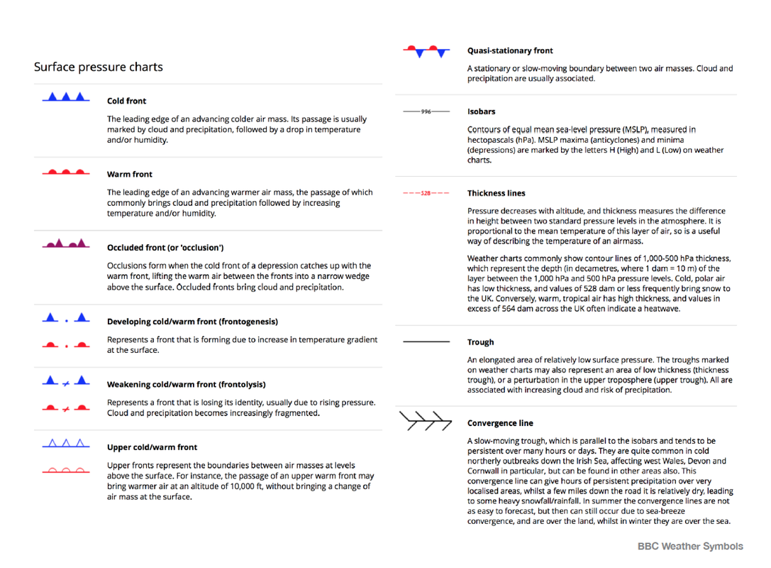
All across the BBC there is a strong visual identity. The symbols are all coherent and very self explanatory all with scientific links. They work as a group of icons and as individuals. As the BBC produce the shipping forecasts
|
it's interesting to see that there isn't even an online visual to be able to check quickly or even live updates, something which in todays world is most likely quite easy to do!
|
|
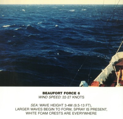
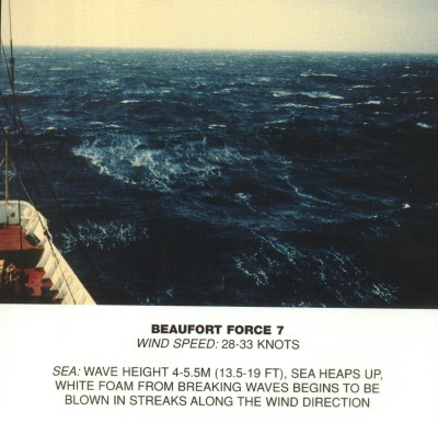
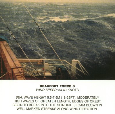
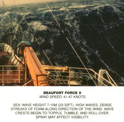
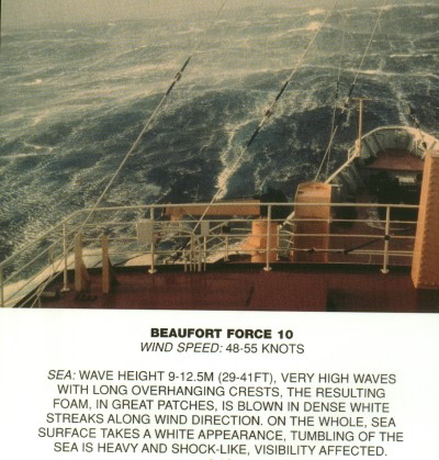
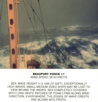
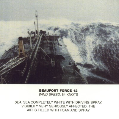
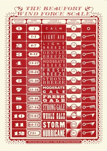
The Beaufort Scale is a measure that relates wind speed to observed conditions on land or at sea. It is used in the Shipping Forecasts to create a visual comparison for the listener. They offer 'Gale Warnings' if winds of force 8 are expected, 'Strong Gale Warnings' are issued if winds of force 9 or frequent gusts of at least 52 knots are expected. 'Storm Force Warnings' are issued if force 10 of frequent gusts of at least 61 knots are expected, 'Violent Storm Force Warnings' are issued if fore 11 or frequent gusts of at least 69 knots are expected, 'Hurricane Fore Warnings' are issued if winds greater than 64 knots are expected.
The Beaufort scale is a good and relevant example of information displayed and visualised in many different ways. It's got a symbolic description, a numeric description, a photography description and there are many other examples such as illustrations and paintings all used to visualise each and every scene from force 1-12 on the Beaufort Scale. This is an interesting way to approach the visual language of the Shipping Forecasts and to analyse and create something that explains each individual weather forecast as well as describing in many different forms and styles. |
IMAGES ARE NOT MY OWN, NO COPYRIGHT INTENDED. JAMES BROWN
|
|
With an in-depth history into the Beaufort scale and its findings by Francis Beaufort it shows us what an accident the Beaufort scale actual is, brief recordings started by Francis Beaufort to document his journeys in a private journal, his notations dating to 1805 with the official scale coming more to live in 1829.
Depicting different official styles of execution to present the beaufort scale we get an overall feel to each of the 1-12 stages, through image, symbols, letters and description. The fact sheet from the Met Office also includes a brief history of existing methods such as Daniel Defoes 'Table of Degrees', a 12 point scale which shares the same basic principle of the Beaufort scale but with descriptions of 'gales' in a couple words. For example: Stark calm, Calm weather, Little wind at the beginning of the scale up to A fret of wind, A storm and A tempest, being the most violent of conditions. |
|
|
Below are three visual systems that the majority of people are very familiar with. The apple symbols are simple and in a user interface there intuitive. The icons were modernised in 2013 with the IOS 7 update which stripped them back, flattened and reinvented them. The brightness and individual colours of each symbol help to define which makes it easier for them to become known.
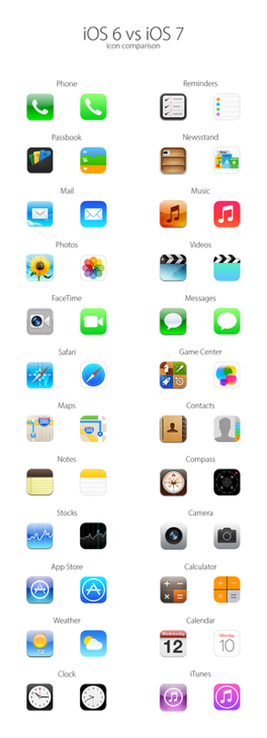
(Above) Apple Symbols and how they've evolved. Internationally
recognisable to everyone, not just Apple users. |
The road signs however are a lot more refined because they have a few different shapes meaning different things which are universal and understandable across countries, for example red circles mean no and red triangles are warnings and awareness. The car dashboard icons remain the same in any car and are all easy to define.
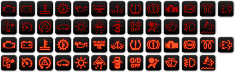
(Above) Car Dashboard Symbols, Internationally Recognisable.
(Below) Traffic Signs, They are all transferrable between countries. 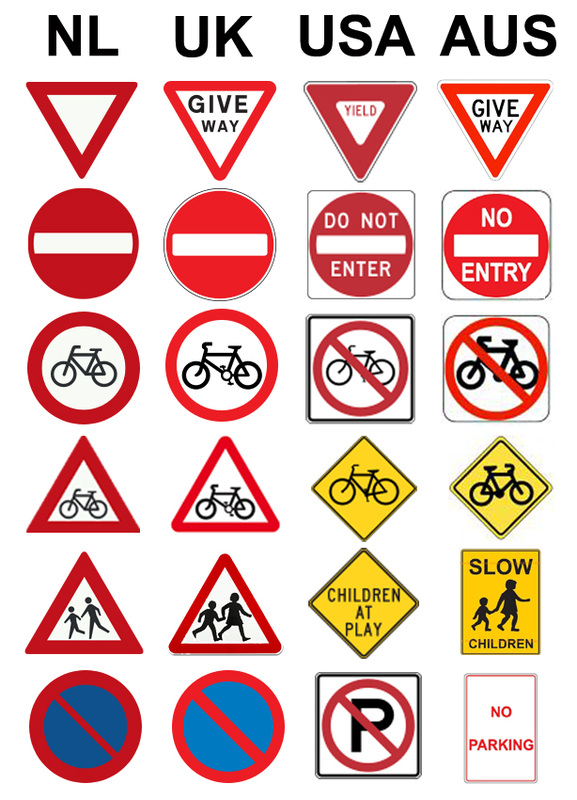
|
|
Visual brand language is branding terminology for a unique 'alphabet' of design elements such as shape, colour, materials, finish, typography and composition. All of these create subliminal and direct links to communicate the brand and its company values, this gives it a personality and if done well makes a very successful brand. Together these create the signature of the brand, things it becomes known for. Example, BMW is renown for a split grill, it's apparent on every vehicle. Yes, the size and shape has changed and altered slightly but this is part of there brand signature and style which makes them known.
|
There are a few things necessary in this process to help create the overall visual language of a brand:
- Brand Personality (Identity: Emotional, the consumer can relate). - Product Attributes (Distinguish against it's competitors). - Design Principles (Visual concepts to help express the brand). - Signature Elements (Creating and translating visual brand language through colour, material and finish). All of these stem back to the personality of a brand and extend into these elements to give a brand its unique feel and 'signature'. |
|
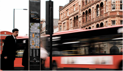
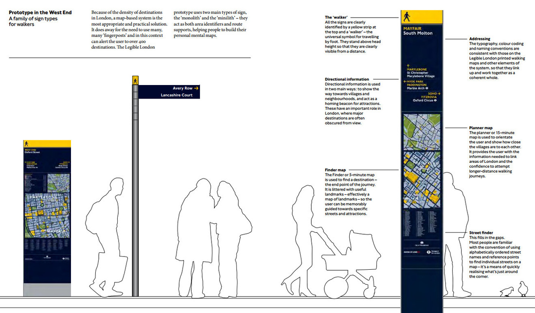
Legible London is a wayfinding system for London. It was initiated and designed for pedestrians by Transport for London. It is being rolled out across the capital in conjunction with London’s Boroughs, landowners, developers and businesses.
Unlike other wayfinding projects, Legible London started from scratch in order to provide one consistent visual language and wayfinding system across the city. One that people would understand and be able to interact with, having no real geographical or visual information understanding skill. This city wide approach was used to help visitors and local residents to easily gain local geographic knowledge regardless of the area they are in. There are approximately 1300 Legible London signs – known as Monoliths, Midiliths, Miniliths and Fingerposts – installed across London and the system is continuing to expand. It has also inspired many other way finding inner city and town systems such as Bristol, Cardiff, Exeter and Cheltenham. |
|
|
|
|
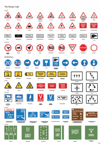
MARK BALLARD - FLYWAY CODE.
Inspired by a news article about New York skyscrapers needing to dim lights because of Migrating birds, Ballard saw the opportunity for a niche project. As NYC sky scrapers were killing birds he saw it as a good idea to help, in ways the sky scrapers couldn't, he created a take on the 'highway code' to help birds navigate there way around safely and orderly.. Taking on from the traditional highway code he just evolved signs meanings and created slightly different meanings. STOP became HOVER and BUS LAND became DUCK LANE. 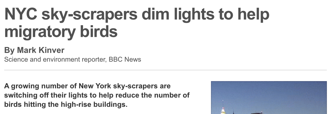
|
|